Client
John Jacobs of
Lenskart.com
Contribution
UX Design, User Research,
UI Design, Prototyping & Testing
Other Contributors
Dhruv Wali, Product Manager. Now working at The Times of India
Tools
Sketch, Google Analytics
Timeline
Dec 2017

John Jacobs is a affordable-premium eyewear brand of Lenskart.com. India needs a premium brand for eyewear but one that is not extremely expensive. John Jacobs is a trendy designer eyewear brand, that is fast creating a name for representing top international styles at affordable prices.
As for the designs, they have partnered with the Italian design house - Mazzucchelli to bring to you an assortment of eyewear with premium quality and stunning designs. Their 180-degree product simulation feature enables you to buy eyewear online without any hassles.
We have eliminated the middlemen to keep our prices low, so that you don't have to pay over the top.
Our product team blends centuries-old craftsmanship with modern lifestyles to re-shape optical designs.
Our collections are made of handcrafted Italian acetate, natural pure wood, titanium and bullhorn. So that you get the very best.

Enhance the usability of the eyewear collection page and product detail page through redesign efforts. Elevate the UI design to exude a premium aesthetic that resonates with the target customer base.
This redesign of the listing & product display page of John Jacobs aimed to enhance conversion rates and work seamlessly with John Jacob's offline stores and processes.
We also set some key performance indicators (KPI’s) as goals for us as a team to achieve, ensuring an optimal user experience and improved business outcomes.
We analyzed our performance data from the past few months and conducted a study of the existing site to assess the feasibility of achieving the proposed targets. Following this, we gained the confidence to embrace the challenge.
Before beginning work on the design for the website, we discussed what our approach would be and ascertained the following guidelines:
Our Lenskart team had conducted extensive market research before we delved deeper into it. This research positioned eyewear not only as a utilitarian necessity but also as a fashion statement.
We enjoyed complete creative freedom to craft the necessary design, unbounded by the limitations of existing desktop website designs.
One of our goals was to establish a seamless connection between the website and offline stores, enhancing the overall user experience.
Performing A/B testing to determine the right approach, if there is any disagreement.
This meticulous process ensures our dedication to a user-centric design approach, reflecting our commitment to both usability and aesthetics."
We worked very closely with the product managers & other stakeholders to identify the problems and recognise the user’s needs. This meant studying the research documents and examining the current website analytics very closely. We then designed user journeys that didn’t repeat these problems while simultaneously addressing the needs of each type of user.
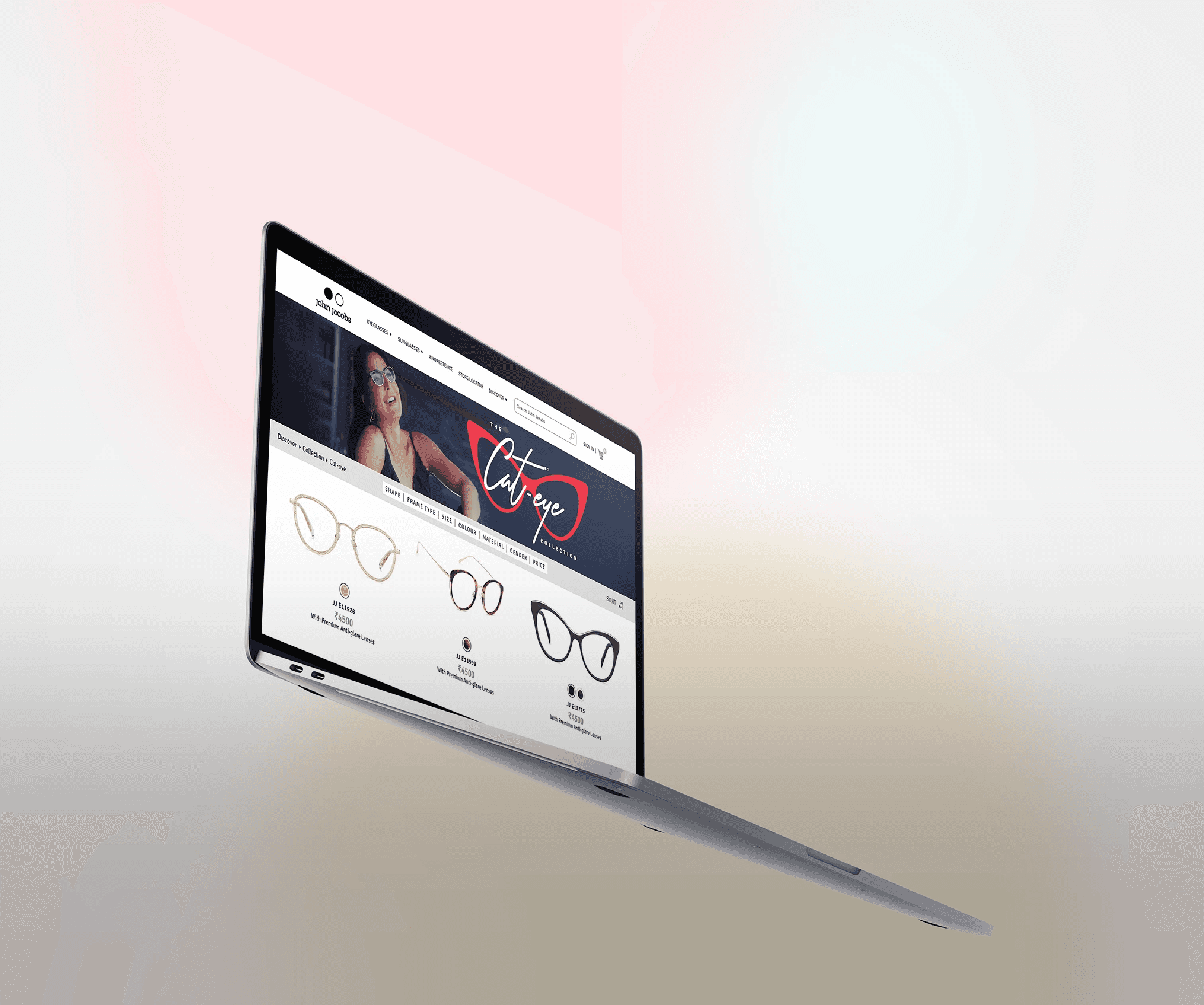
We wanted the web experience of the collection page to reflect a person’s experience of walking into the store as closely as possible. We observed that customers that purchased glasses were trying on more than 30 frames per session and wanted to bring that learning to the web. We designed the interactions such that they allowed customers to easily & clearly view different frames on single fold, Gave the option to change colour of similar frame shape, thus increasing the chances of conversion greatly.
Less is More
For a lot of people, eyewear is an integral part of their life. It’s the first thing you wear as soon as you wake up and start the day. But over the last few years, it’s become more than that, it has occupied a space outside of utility and become a style statement. We wanted to take advantage of this positioning and treat the website more as a premium fashion brand as opposed to a utilitarian one. We therefore kept the site as simple as possible to maintain the premium look & feel. Technology provides lot of choices. But choices is not what humans want. Humans want to feel psychologically satisfied with the choices they have made. We designed the site that helped narrow choices for a user with each subsequent step, simple yet useful.
While talking to people at the client’s stores and asking why they shopped at the store instead of shopping online, we understood their reasons for doing so. This made it clear to us that attempting to convert users to shopping online only would not address all their needs. We therefore took a “universal commerce” approach where we kept in mind the offline features that were important to some of these users.
We tested the prototypes we designed on 10 users and recorded the user’s activity while performing various everyday tasks. We asked them specific questions to understand what the user was feeling. We understood the successes of the system we had designed and identified a few optimisations that we could make based on this test. We then made these rectifications before finalising
Reply from a user when asked about
his thoughts on John Jacobs:
"I recently purchased a pair of sunglasses, and I absolutely love them! The company positions itself as a premium brand offering fair prices. Spending ₹5000 for 2 pairs was definitely worth it to me. I don’t understand why being an Indian brand should prevent it from being considered premium."
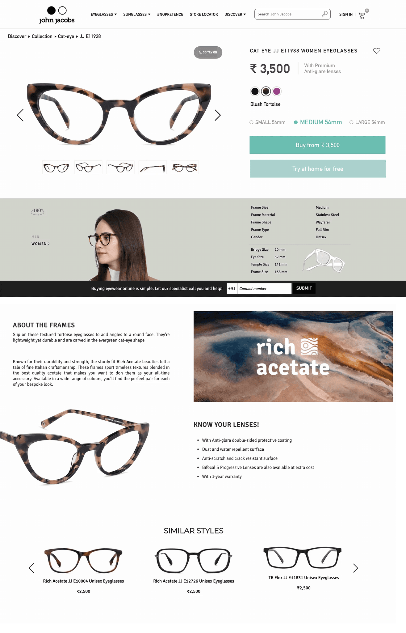
Responses like these provided us with insights for the UI design. We designed the UI for the Product Detail Page and Listing Page to be clean, minimalistic, and exuding a premium aura. Our aim was for each pair of glasses to be perceived as premium, on par with brands like RayBan and other luxury brands, all while maintaining reasonable pricing.
We have implemented the design we created on the website. All key performance indicators are looking up.
No. of user who found new design engaging
32/40 in-store test
No. of user who found new design clearer
34/40 in-store test
Offline integration success
100% offline features
Conversion
PLP to add to cart conversion 15.4% increase
Google analytics data
Engagement
Bounce rate decreased by 9.5%
Google analytics data
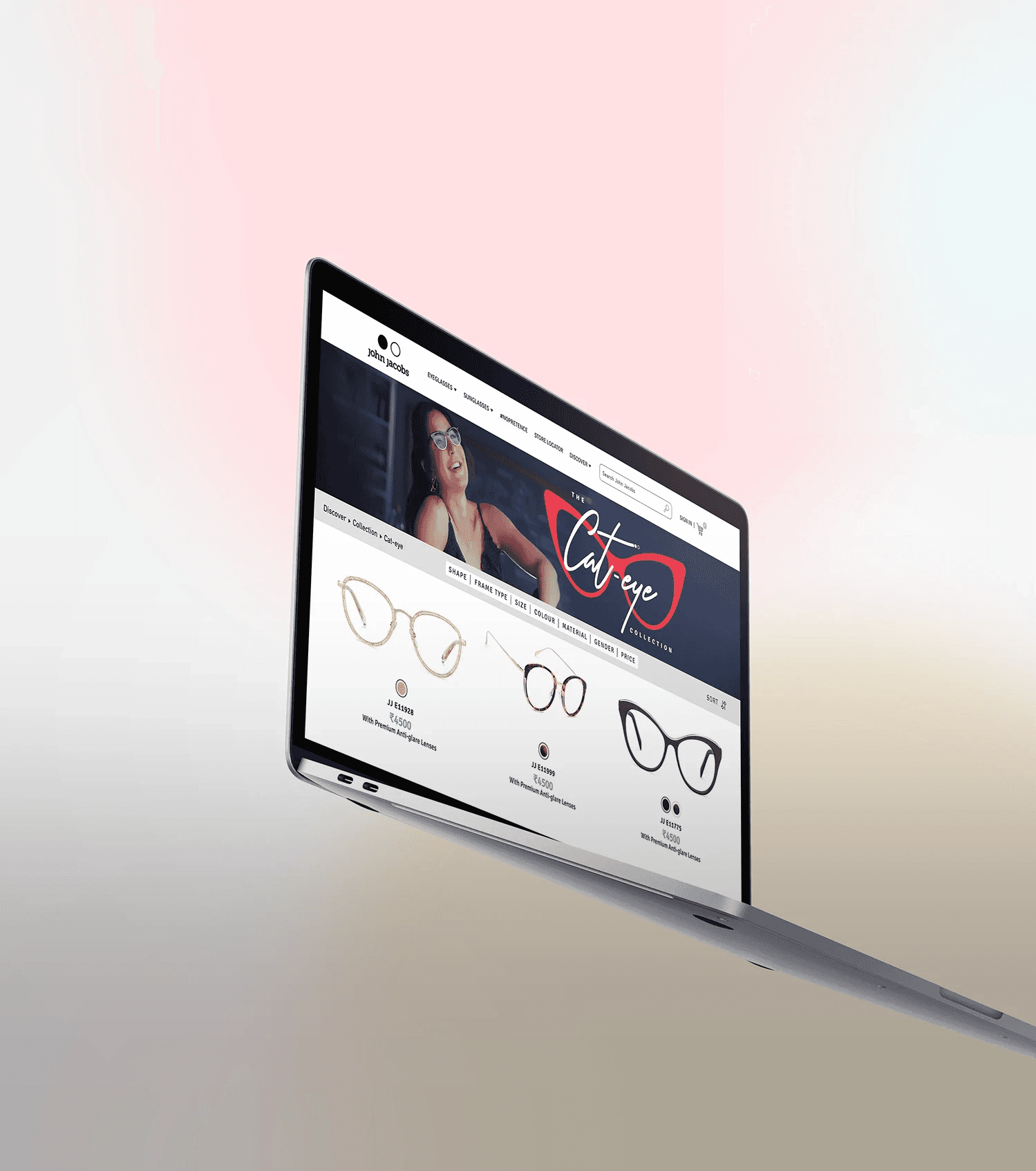
Images/video recordings of LIVE site
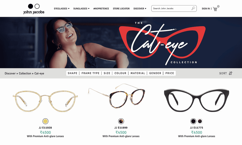

Screenshot of LIVE site
