My Contribution
Leading UX Design, User Research, Interaction, UI Design, Prototyping & Testing
Contributors
• Anirban Borah (Product Designer),
• Abhishek Thakur (Product Designer),
• Apurv Mishra (Product Manager)
Tools
Figma, FigJam, Hotjar, Google Analytics
Timeline
May 2019 - July 2019
Go-live date: 16 July 2019
In my role as the design stakeholder for this Swiggy Dineout project, I led a collaborative effort to improve the user experience. I closely worked with a talented team that included:
• Product Designer: Abhishek Thakur (responsible for crafting the visual design elements)
• Product Manager: Apurv Mishra (who championed the product vision and ensured its alignment with user needs)
• Stakeholders: Representatives from various departments across the organization, including Business, Technology, Marketing, and Customer Acquisition.
Dineout's current Restaurant Display Page (RDP) is experiencing a significant drop in user engagement. This decline is attributed to several key usability and user experience (UX) issues.
Evidence
• User Drop-off: A significant number of users are abandoning the RDP, indicating difficulty in finding the information they need.
• Dineout Pay Bill Payment: We've observed a decrease in users opting to pay their bills directly through Dineout Pay on the RDP. It is Dineout's primary revenue generator.
• Lack of Trust: Users are expressing concerns about the absence of sufficient restaurant reviews, leading to a lack of trust in the displayed information.
• Limited Information: Users are requesting more details about the restaurant's atmosphere, food quality, and current activity level (e.g., busy vs. quiet).
Impact
• Reduced user engagement with Dineout's core functionality (restaurant discovery).
• Reduced revenue due to a decrease in Dineout-Pay transactions.
• Increased user frustration and potential app abandonment.
Difficulty for restaurants to attract customers through the platform.
Goal
Redesign the RDP to significantly improve usability and user experience, leading to:
• Increased user retention on the RDP.
• Increased conversion of users to Dineout-Pay for bill payment, boosting revenue.
• Enhanced trust in displayed restaurant information through the inclusion of user reviews.
• Improved user decision-making through the provision of richer restaurant details (ambience, food quality, current activity).
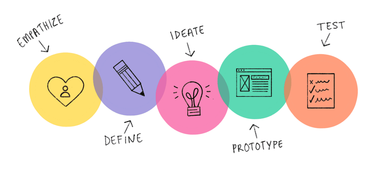
At Dineout, we embrace design thinking to empathize with our users and uncover their needs and goals. By involving all stakeholders in the design process, we foster collaboration and shared ownership, ultimately leading to the creation of better products and experiences.
First, it was necessary for us to understand the existing user flows & sitemap. Later, this will help us in creating the user journeys in a much better way.
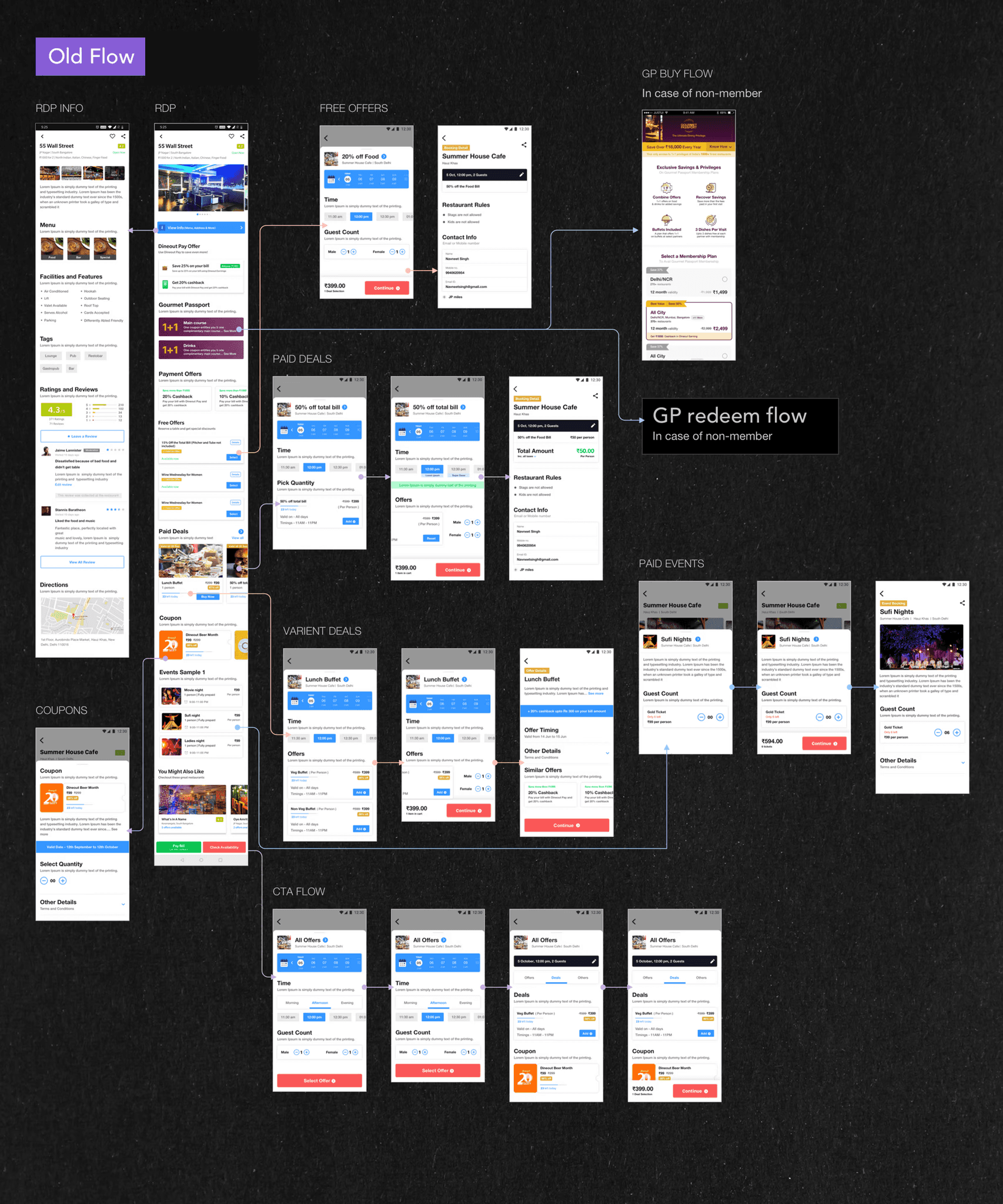
The RDP leads to all the major flows ie. booking, payment, buying offers, memberships buy & redeem flow, deals buy & redeem, coupons buy, event buy etc. It also leads to informative pages like restaurant info, offer details etc. Understanding the existing information architecture as a team helped us in finding out a few major existing problems.

1. Content overload
RDP is extended in two pages. User drop-off is inevitable.
As you can see from the flow (refer to 2nd image), Offer redemption flows of different offers like Deals, Coupon, Gourmet Passport, Free Offer etc. are very different from each other. There are too many steps in each flow. For example, "Deal redeem" flow is very different from "Gourmet Passport redeem" flow. There are other confusing flows like Free Offer flow & Coupon redeem flow.
2. Lack of priority
Need to prioritize the content.
Need to create visual hierarchy.
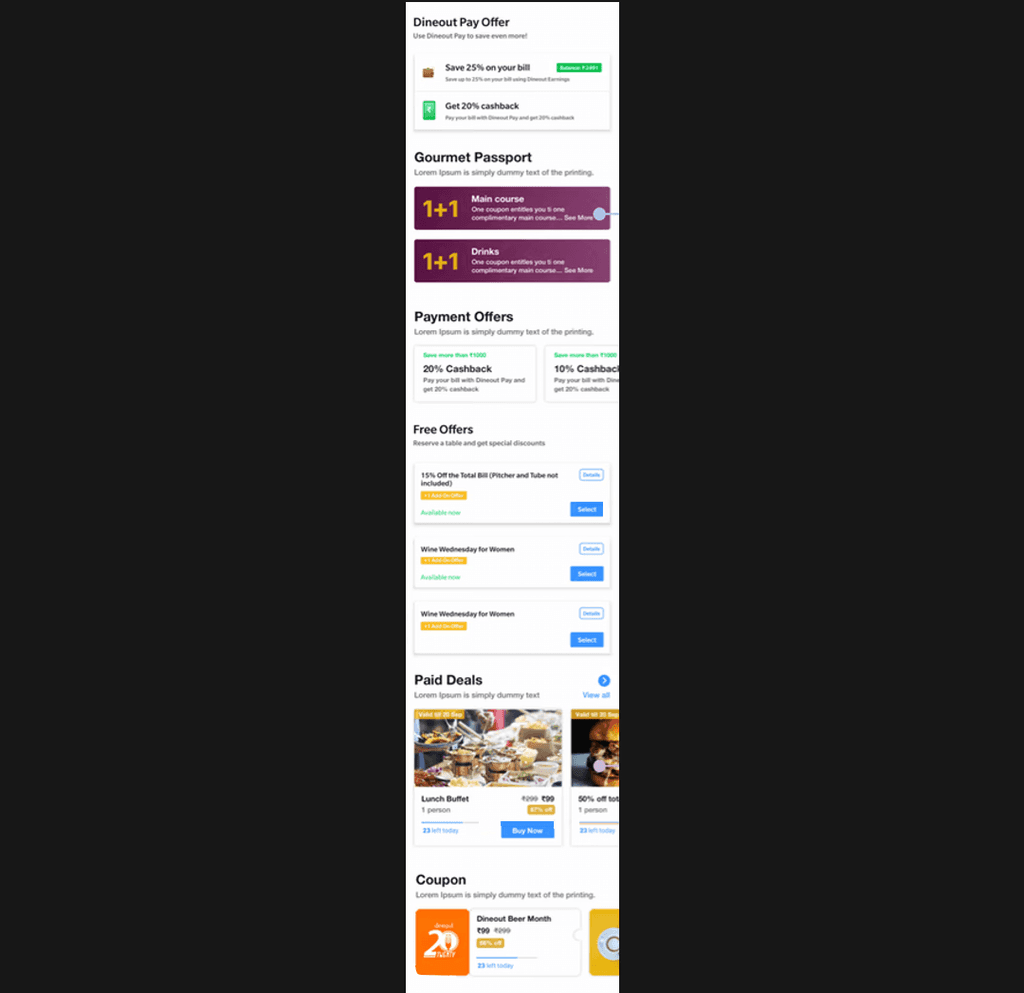
3. Confusing offer section
Too many offer variations leading to analysis paralysis.
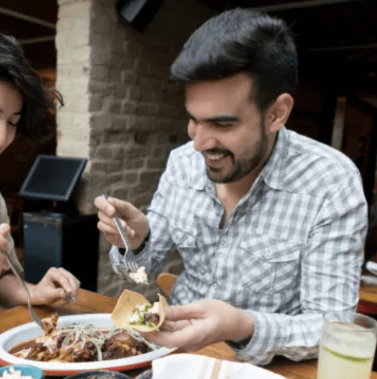



We also conducted Field studies observe how people interact with interfaces in their own environment. Real-world contexts reveal behaviours for which we might not be aware. These contextual enquiries revealed some major flaws in our existing design which we would have never thought of.
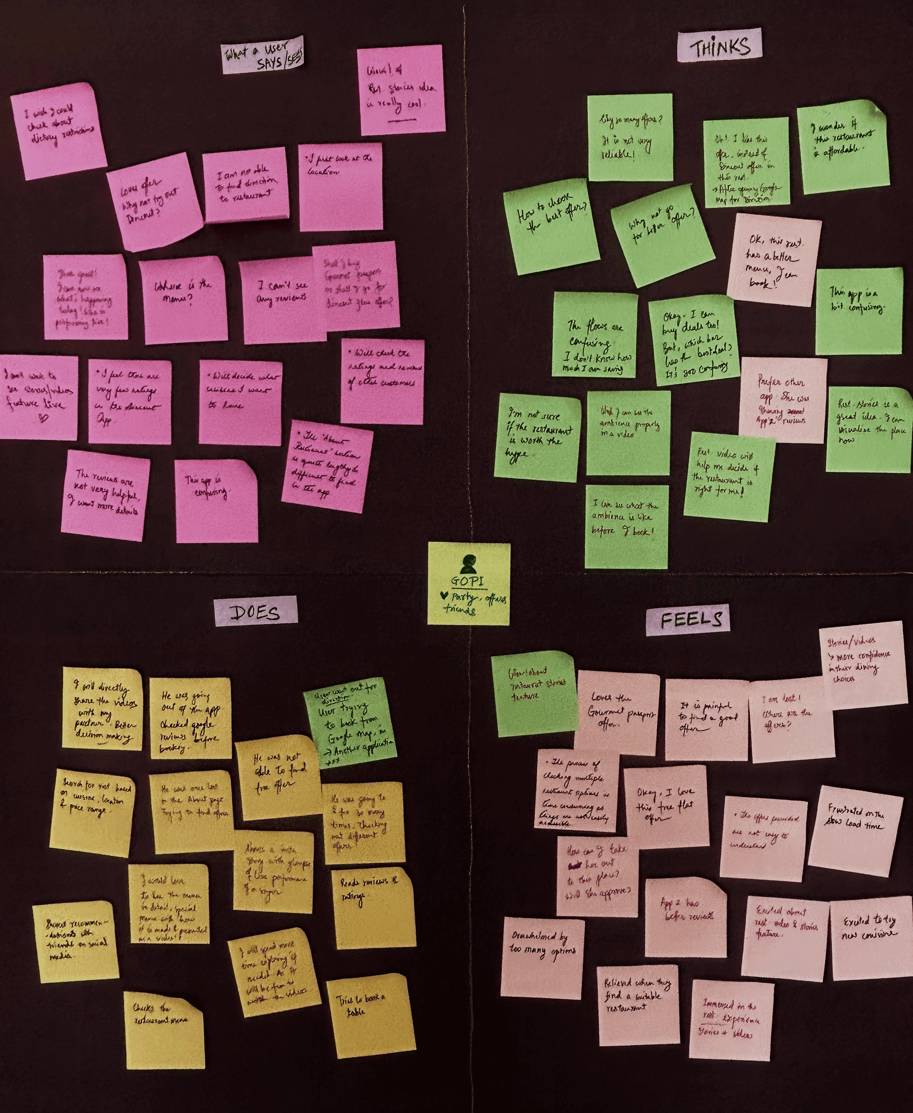
in-depth user interviews help us to empathize with our users and identify opportunities for improvement on Dineout's restaurant display page. By analyzing their thoughts, feelings, behaviors, and pain points, we created empathy maps to gain a deeper understanding of their needs and motivations.
One of the empathy maps we have created during the process.
After empathising with our users and analysing our research data and finding we compile them in a more understandable format and send it to the cross-functional team (key stakeholders). Told them to digest all the findings.
Then we conducted affinity diagramming to organise our research & ideas:
• As a part of the affinity diagramming process myself & Apurv gathered all the key stakeholders & few members from the cross-functional teams (who were involved in this project directly or indirectly).
• Using an affinity diagram template, we first clearly state the problems we are trying to solve at the top.
• We explained our problem statements & told them to go through our observations, findings or ideas from the research & interviews once again. Then, we brainstorm ideas for solving the problems one at a time, recording each idea on a sticky note.
• In the next step, we analyse the cards, I along with Apurv and a few other stakeholders look for the ideas from each sticky note that seem to be related. We stick Similar ideas or viewpoints under a heading on the whiteboard. For example, ideas or viewpoints related to implementing a simplified offer section in the RDP were stuck under the All Offers heading.
• Once the cards have been sorted into groups like All Offers, Hero Video, About Restaurant section etc.; we found out that the About Restaurant section and a few others contain a large cluster of ideas. So we sort them into sub-groups.
Affinity diagramming sessions, and understanding the existing user flows and sitemaps helped us create the user journeys.
It also helped validate certain assumptions we made before.
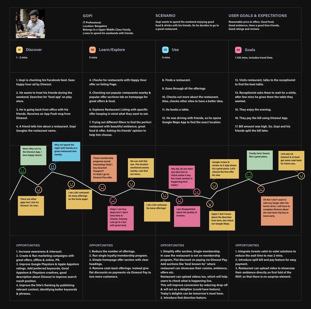
One of the user journey of Gopi we have created during the process.
• Complicated Offer Section: Users are unable to make a decision on which offer to choose & which loyalty program to buy.
• Users are not able to choose restaurant in absence of good quality & quantity of reviews/ratings details and trust on those reviews.
• Large number of users drop off from RDP.
• The flow from RDP to payment is more confusing. There are too many steps and each flow is different from one another.
• Data suggests they hardly explore sections like about, menu and reviews etc.
• Hallway tests indicated people go to Google or other competitor sites to get an idea about the restaurant, then they book in Dineout.
• The RDP is extended in to two pages. User find it difficult to explore.
Based on the user needs & problems found we conducted brainstorming sessions to finalize the major user needs. We gathered all our stakeholders to share their ideas and define the user needs:
• Restaurant Details: restaurant name & cuisine, cost for two, location.
• Video displaying what is happening live, ambience, food, offers etc.
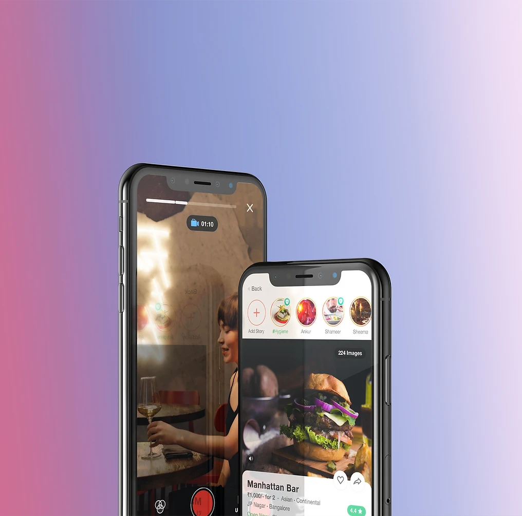
• Restaurant stories: this will help the restaurant showcase what's happening now in the restaurant, their events, promotions, offers etc.
• Offers & Deals: Dineout Passport offer section, Free offers & Deals.
• Ratings & reviews.
• Menu.
• About the restaurant, Facilities & features.
• Timings.
• Direction.
• Event section.
• Need help section.
• Personalised section with suggestions of similar restaurants.
• Option to add to favourite & share restaurant details.
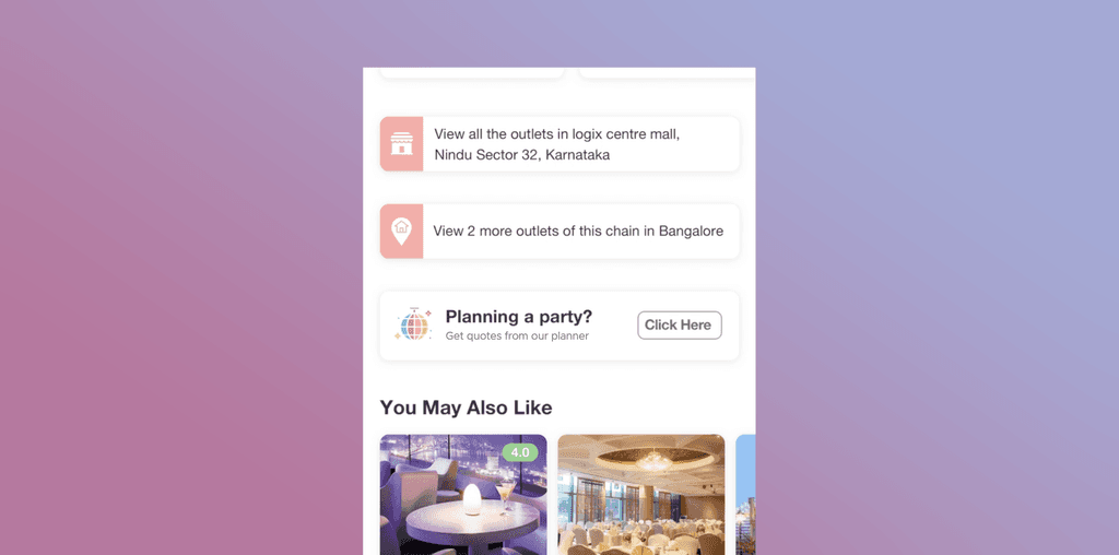
• Booking for a large group/party feature:
While conducting brainstorming sessions with all stakeholders, we learned that we have a lot of users who reach out to the call centre team to request party bookings. This is because we do not have any such option available to users in the app. Therefore, we decided that a section will be made available in the RDP from where users can request party bookings.
As a visual species, humans find videos more engaging, more memorable, and more popular than any other type of content out there.
Video as a means of storytelling and advertising is no longer a nice option – it’s a necessity. If you want to increase conversion and exposure, a video marketing strategy is the only way to go.
• 81% of businesses use video as a marketing tool — up from 63% over the last year.
• 72% of customers would rather learn about a product or service by way of video.
• 85% of consumers want to see more video content from brands.
• 52% of marketers say video is the type of content with the best ROI. By Hubspot
• Including a video on your landing page can boost your conversion rate by up to 80%. By Unbounce
• Videos attract 300% more traffic and help to nurture leads. By MarketingSherpa
After finalising on the user needs we have decided to conduct UX research using Google form. We reach out to around 40 users, Comprising of 14+14 users from both target groups and around 12 stakeholders (from the product, business, marketing, tech, support & content teams). Prepared a numeric rating scale google form comprising of all the user needs. Told every interview candidate that:
"We have listed down a few important things we look after before deciding on booking a restaurant through App or online. Please select any rating from 1 - 10, where 1 is less important and 10 is most important."
We have given three scenarios to make the form more relevant:
1. You are planning a day out with friends at a beautiful bar/restaurant.
2. You are going out on a date.
3. You are taking your parents out for dinner.
So told them to give an opinion on 3 sets of Google form. Told them to imagine each scenario in their mind and share their valid opinion.
Total forms 40 x 3 = 120
This interview session using Google form helped us in prioritizing the major user needs we have finalized from our previous user research.
In our next step, we gathered all our stakeholders & prioritize the needs based on impact vs effort. This helped us in further filtering and prioritizing.
After prioritizing the major user needs it was time for divergent thinking again.
We sat down as a team and tried to sketch out the basic sitemap. This was an iterative process, where we brainstormed, tested and improved it in each stage. Here is an example of the sitemap we created during the process:
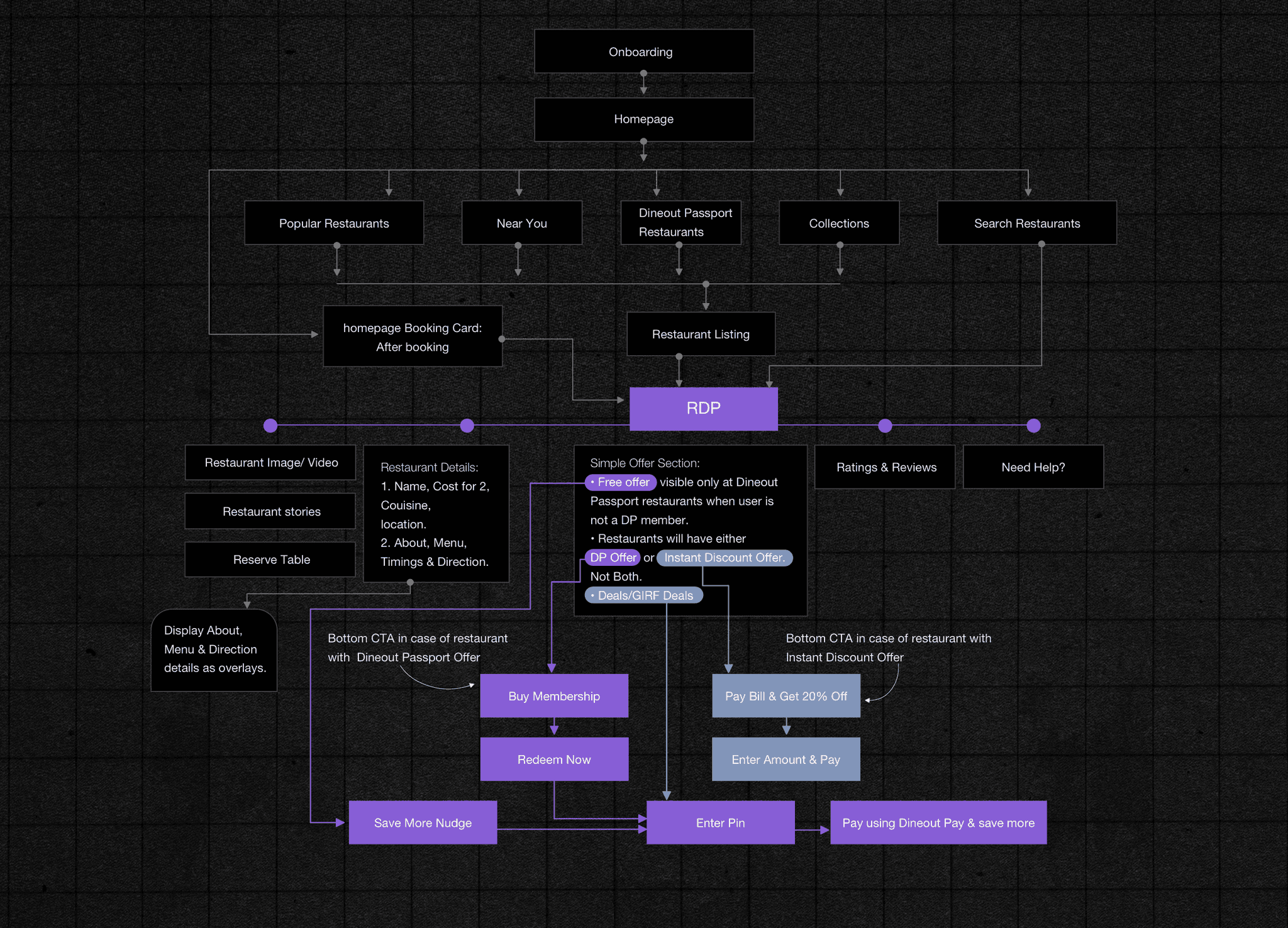
With the help of the new sitemap, we had a list of screens to cover all touchpoints and then we started to create wireframes.
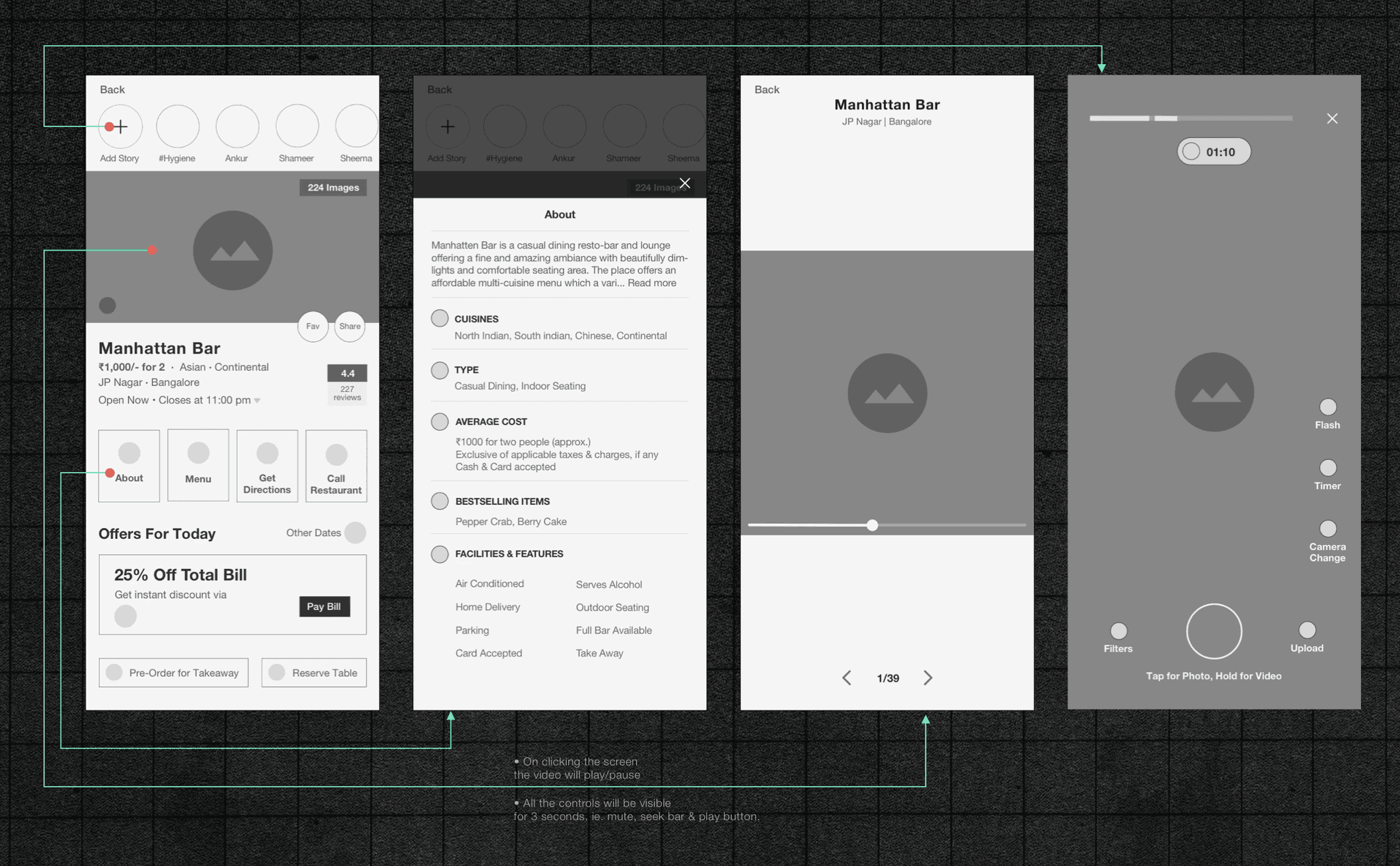
We have created many iterations of low-fidelity wireframes. Then shared our ideas with fellow product team members & business heads. Incorporated inputs from all the participants. After that, we made the high-fidelity prototypes of the Restaurant Display Page. We created two versions of the app for testing.
Testing
40 users, Comprising of 14+14 users from both target groups and around 12 stakeholders (from the product, business, marketing, tech, support & content teams). We gave them specific tasks like:
• Pay bill at X restaurant.
• Upload a story at X restaurant, etc.
and observed & recorded the whole process.
Secondly, We compiled all our findings from the user testing sessions. Shared our data with all the stakeholders and gathered their feedback using a Google spreadsheet.
We converted the user's feedbacks into opportunities and implemented them in our final designs.
One example is that we added a location feature on RDP to solve the problem of:
"users leaving the app to search restaurant location on Google Maps" based on our research.
However during testing, a user told us that he was driving to a restaurant in CP (A location in Central Delhi) and it was hard for him to go to the specific Restaurant Display Page and find a location from there. So we decided to add the "Direction to restaurant" feature on the homepage booking card. Please note that the booking card on the homepage appears when the user reserves a table. This will solve the problem of both the users, ie. quick access to the map and will stop them from leaving the app.
One example,
We added the "direction to restaurant" feature on RDP to solve the problem of:
users leaving the app to search restaurant location on Google Maps.
However, during testing, a user told us that he was driving to a restaurant in CP (A location in Central Delhi) and it was hard for him to go to the specific Restaurant Display Page and find a location from there. So we decided to add the "Direction to restaurant" feature on the homepage booking card. Please note that the booking card on the homepage appears when the user reserves a table. This will solve the problem of both the users, ie. quick access to the map and will stop them from leaving the app.
Testing Notes
Notes taken during the testing of the Hero Video & restaurant stories:
Problem 1
Complicated Offer Section
Users are unable to make a decision on which offer to choose & which loyalty program to buy. We have 2 loyalty programs: Gourmet Passport Membership & Dineout Plus.
Also, we run various offers like Dineout Pay Cash-back Offer, free offers, coupons & deals. In the Dineout pay offer, we give cash-back to the users. Free Offer is a flat offer. Coupons can be applied during checkout. Deals are flat discount offers one can buy at a very reasonable price.
All these number of choices leads to analysis paralysis. It happens when a user overthinks & over-analyses a decision to the point where no decision is made & no action is taken. This behaviour leads to a decrease in user engagement & fewer sales.
The best way to reduce choice overload is by reducing the no of choices we offer. We evaluated our product offerings and looked for areas of overlap. After many meetings/brainstorming sessions with stakeholders from product, business, sales, and marketing we finally decided on keeping only 3 offerings for Dineout users:
• Flat discount
Instead of Dineout Pay cashback, users will get Flat Discounts. This will attract more users and reduce DO-pay burn from heavy cashback. The prominence of Flat Discount offer was improved, as it is our main revenue stream. The Flat Discount will be visible only to users who are not Dineout Passport members.
• Dineout Passport membership offer
We will merge both the existing membership programs ie. Gourmet Passport & Dineout Plus (for corporate clients) into one.
• Deals/Great Indian Restaurant Festival (GIRF) Deals
Deals will be visible only during specific occasions, mostly during GIRF.
Problem 2
Offer redemption flows of different offers like Deals, Coupon, Gourmet Passport, Free Offer etc. are very different from each other.
There are too many steps in each flow. For example, "Deal redeem" flow is very different from "Gourmet Passport redeem" flow. There are other confusing flows like Free Offer flow & Coupon redeem flow.
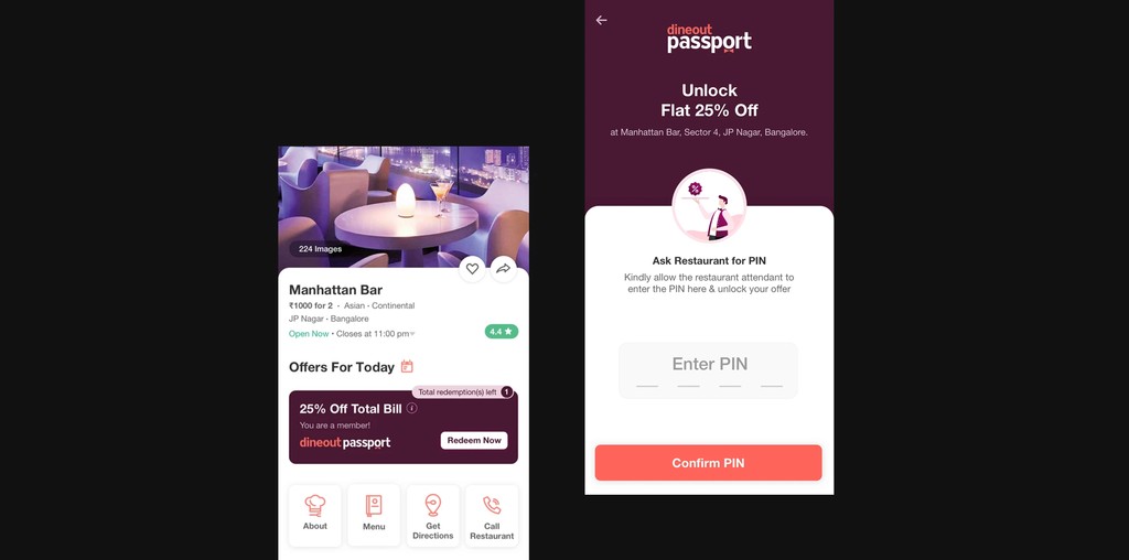
Now we only have 2 offerings. So, we introducing a similar PIN-based flow for both offerings:
1. Deal/Great Indian Restaurant Festival (GIRF) Deal purchase from RDP:
2. Dineout Passport offer redeem.
By implementing a PIN-based checkout system, we significantly reduced errors in restaurant selection during payments. Also reduced fraudulent activity during deal redemptions.
This streamlined process resulted in a around 10-second reduction in checkout time, providing a faster and more secure payment experience for users. Checkout abandonment was reduced by 14.3%.
Please note that…
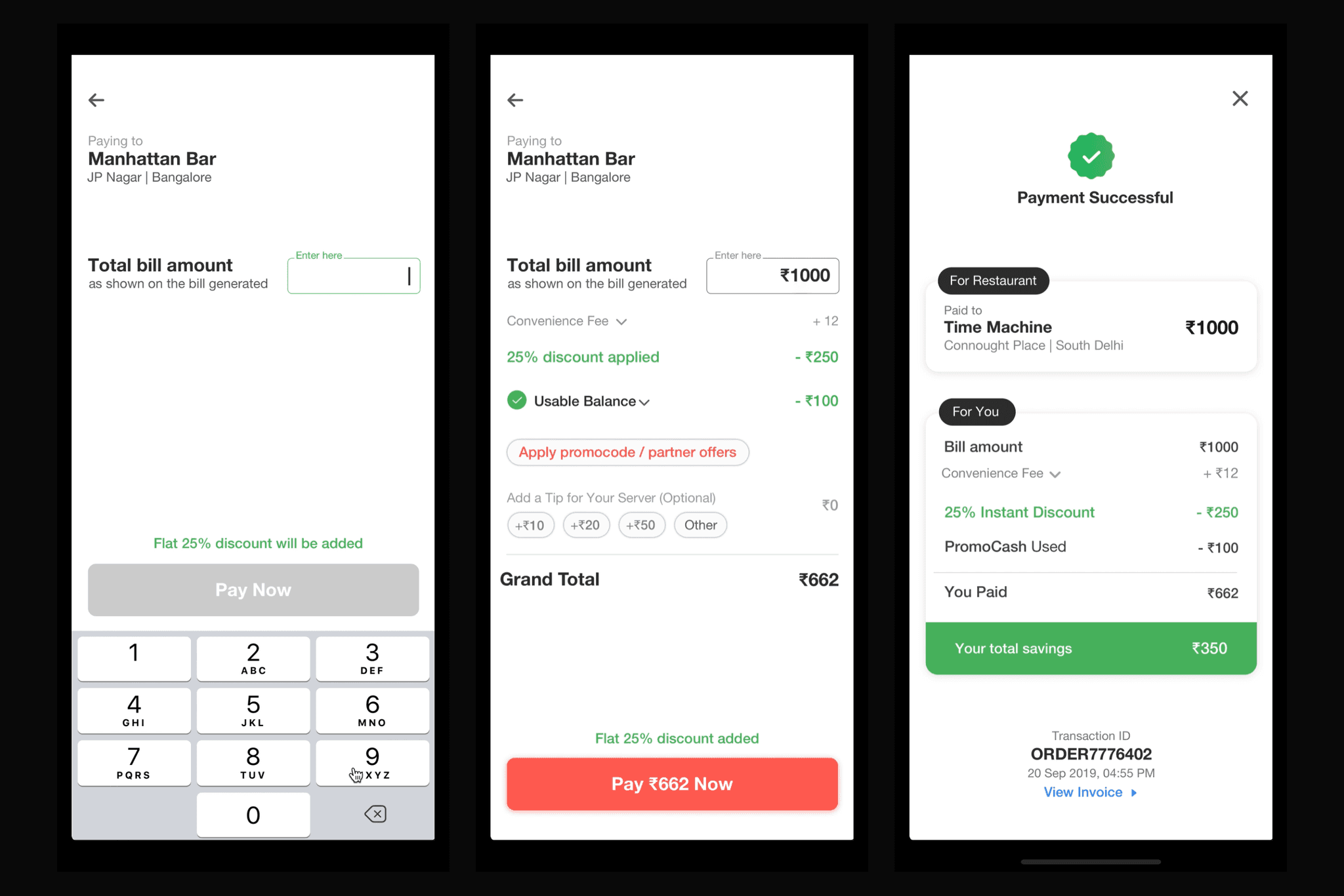
Following the RDP redesign, we also improved the Dineout Pay flow from RDP. This was done to gear up for Great Indian Restaurant Festival (GIRF).
We kept everything simple and easy for users to have a smooth transaction. Check out the redesigned flow: The user clicks on 'Pay bill' on the Restaurant Display Page.
I will share more details on Dineout Pay flow improvement in another case study.
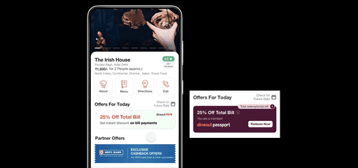
• Merged both more info and offer page into one with better usability. We improved the visibility of features like About section, Menu, Review & Direction in the RDP page so that the user can easily access them with a click.
Restaurant Details:
Collate all information related to the restaurant which is not being shown on the RDP such as facilities available, Restaurant description, Restaurant Type, Cost etc.
Menu:
A quick view of the restaurant menu.
When a user clicks on the Menu section a new page with full-screen images will scroll up. There are different sections for Starters, Mains, Bar, Beverages etc.
Directions:
Give a quick view of the locality where the restaurant is as compared to the previous RDP. On clicking on Direction, Map pops up. One can go to Google Maps from there.
Problem 3
RDP was extended into two main pages. To simply explore the restaurant user has to take many to & fro steps.
One for offers & one for restaurant details. During user testing we found out most of the customers goes to the restaurant info page and they again come back to the offer page to view the offers, then the goes to the booking flow.
Problem 4
Currently, a user is not able to see the reviews related to the rating in the RDP. It was hidden deep inside 2nd page, and not very user-friendly.
Users are not able to decide about a restaurant by looking at the images. They prefer Google reviews or competitor sites to learn about the restaurant. This is due to the lack of a strong user review section in Dineout.
• We redesigned the ratings and review section for better visibility and easy access. On clicking on the Reviews user will scroll down to the ratings & reviews section. In case of colour use/UI design, we have incorporated food-related shades of green, yellow & orange in the ratings section.
• We redesigned the ratings and review section for better visibility and easy access. On clicking on the Reviews user will scroll down to the ratings & reviews section. In case of colour use/UI design, we have incorporated food-related shades of green, yellow & orange in the ratings section.
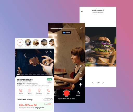
• Now restaurant image section at the top has the functionality to add videos. Now restaurants can showcase their ambience/food in the Hero Video section.
• Restaurant stories feature will act as a delighter adding more values to the RDP.
It will have the latest food images & videos uploaded by Dineout users & restaurant owners. This will also help users to easily decide on restaurants based on current events or looking at special menus curated for the day etc.
We leverage tech from MX Player, a video streaming platform of Times Internet to build the stories feature.
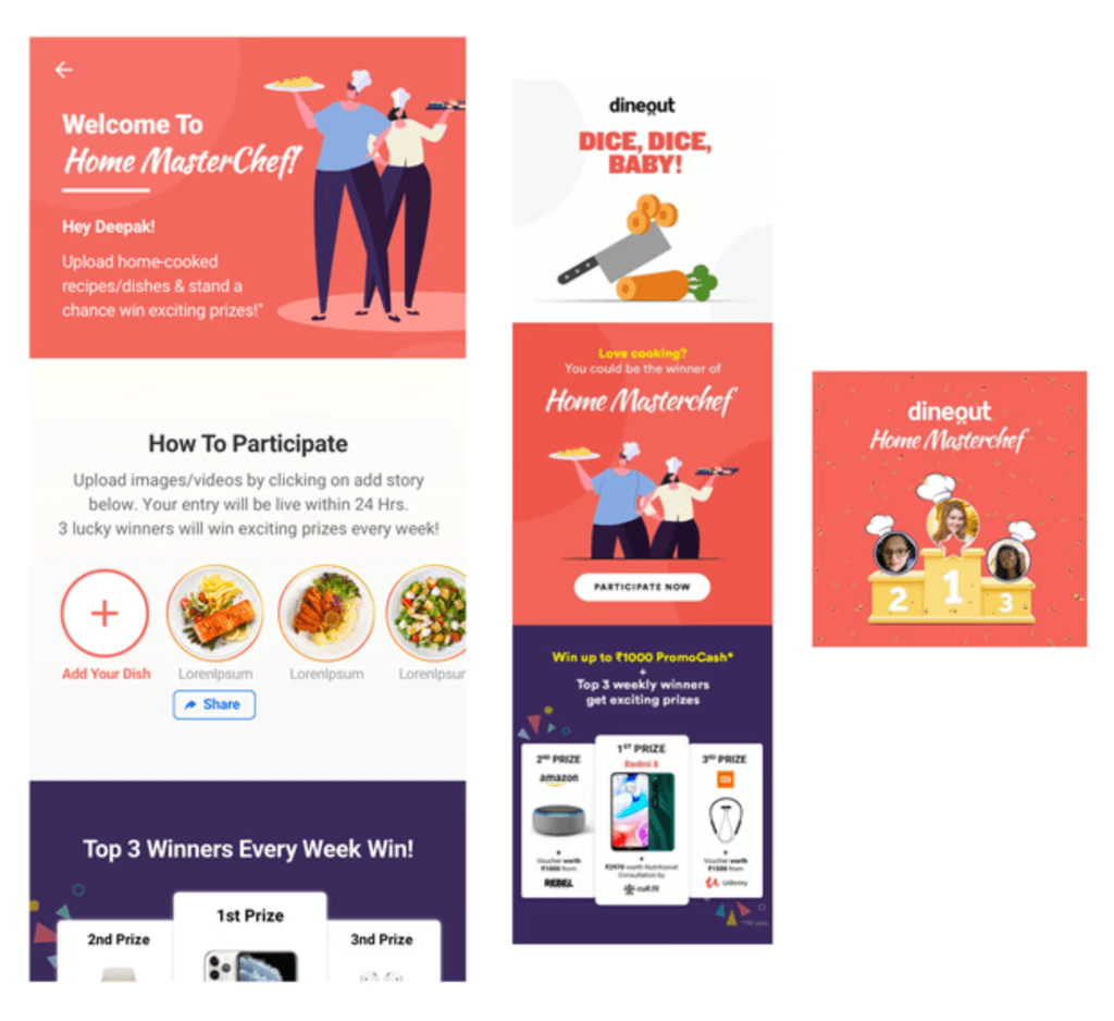
The addition of story features proved to be very successful. Later on, we also used it on the Dineout homepage to run campaigns like Home Masterchef, where users were told to upload home-cooked food stories and win cashback & other prizes.
Problem 5
The option to book a restaurant for an office party or large gathering was not available.
While conducting affinity diagramming sessions with all stakeholders, we learned that we have a lot of users who reach out to the call centre team to request party bookings. This is because we do not have any such option available to users in the app.
We decided that a section will be made available in the RDP from where users can request party bookings.
This section will request for following fields:
Occasion
Party date
Party time
No. of people
Food Options (Veg/Non-Veg/Alcohol)
How it will work:
Once the user raises the request, this same request will flow to the restaurant for confirmation.
The restaurant will have a TAT to act on this lead.
Once the restaurant has taken the action, they will close the lead as Accepted or Rejected.
Party booking can be enable/disabled at following levels:
• Restaurant
• City
The success of an App or website UX lies in engaging users and meeting business goals. Here are few key highlights:
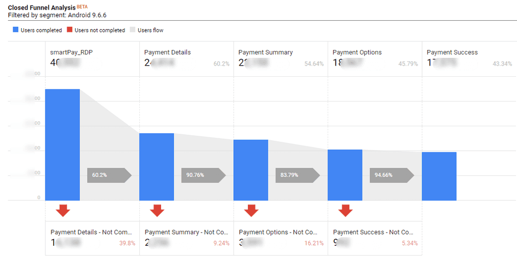
Significant increase in RDP Pay Bill CTA click conversion.
Google Analytics metrics of the same:
Before
47.27% (Success screen conversion: 30.78%)
After
60.2% (Success screen conversion: 43.34%)
Reduction in RDP load time by almost 2s.
The simplified offer section helped users quickly decide which offer to choose before payment. Additionally, the simple offer redemption flow greatly reduced drop-offs during the payment process.
Both helped in increase in Dineout Pay transactions and booking conversions.
The addition of party booking feature was a cherry on top for Dineout.
More crowd = more bill amount = more revenue for Dineout & restaurant. Everyone is happy.
Home MasterChef x Dineout Stories
To stay relevent during the Covid crisis we collaborate with the marketing team to come up with the idea Home MasterChef. Its a virtual cooking contest that allows our users to participate by uploading their home recipes using the Dineout Stories.
Home MasterChef Key Highlights:
About:
• WHAT: A one-of-a-kind virtual cooking contest that
allows participants to show-off their cooking skills and
win weekly prizes.
• WHY: To stay relevant during the COVID crisis and
improve app engagement using the Dineout Stories
feature.
• HOW: Encourage users to upload their recipes as a
'story' on the app. Pick top 3 winners, after 3 rounds
of shortlisting, every week and gratify them.
Performance:
No. of stories on app: 23,076
Avg. session time on app increased by 34% (vs April)
Impressions: 2.8M+
Engagement: 112K+
The new RDP design went live on the Dineout App on 16 Jul 2019.
Next month Aug 2019, Dineout witnessed phenomenal success for its Great Indian Restaurant Festival:

