Client
Azah
Freelance Project
Contribution
Branding, Visual Design
Tools
Adobe Illustrator, After Effects, Photoshop, Sketch
Timeline
May, 2017
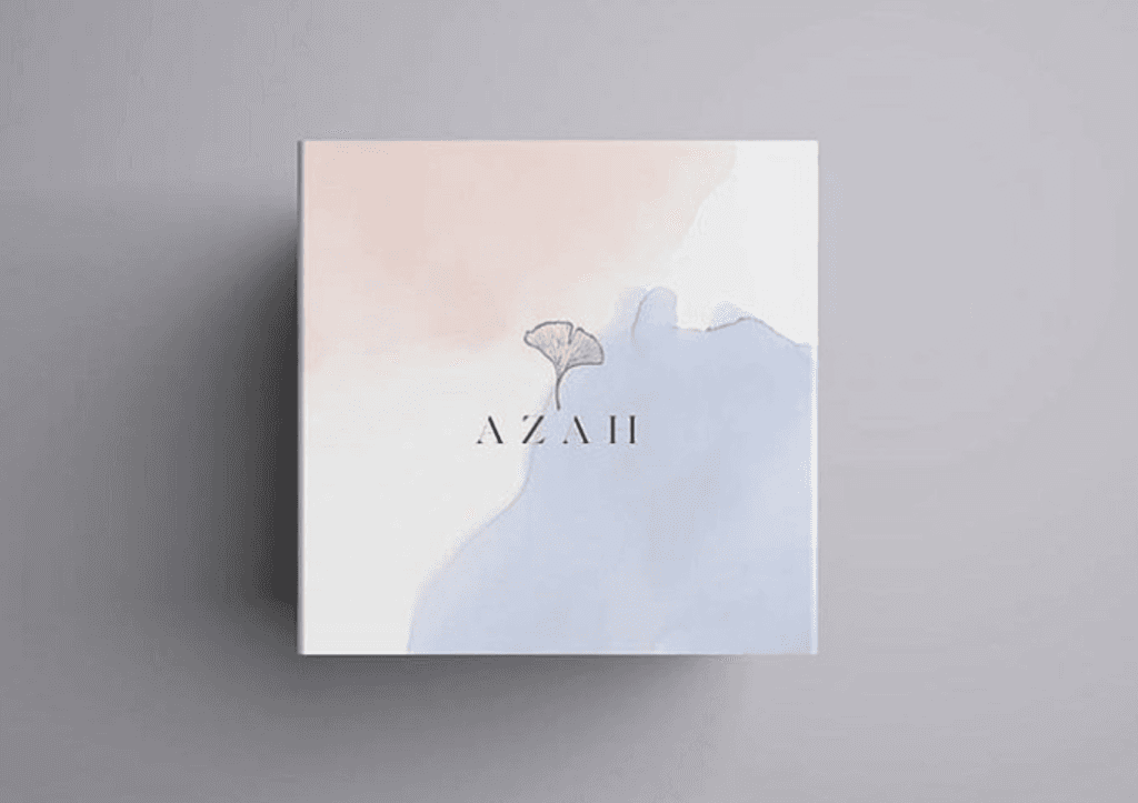
Azah, a Hebrew word, which means strong and bright, caters to the needs of quality-conscious urban consumers and focuses on solving some of the most critical problems in the feminine hygiene sector, and aims to be "a one-stop solution for high-quality women's hygiene products in India"
One of the promotional video I have created for Azah:
In Indian culture, talking about menstruation is still considered a taboo. Periods have traditionally been seen as something ‘unclean’, with women being forced to go to great lengths just to hide any signs of it. From not being allowed to enter into temples, to being forced to stay outside of the kitchen, there are a lot of archaic superstitions and rules that people still enforce.
The name Azah is based on the Hebrew word "Aza", meaning strength. Through Azah, we aim to help the Indian woman realize the immense amount of strength she carries within herself. We want to stand, hand in hand with her in her fight against everything that discourages her from truly being ‘her’. Especially against the culture, that treats menstruation, one of the most significant parts of her identity as a woman, akin to a taboo. With Azah, we want to change that and be part of a much greater social movement, aimed at transforming the way Indian society treats its women, with a special focus on menstruation and feminine wellness to begin with.
Our Keywords:
Organic
Premium
Feminine
Light Weight
Our major product segment:
Sanitary Pads
Why our products stands out?
Azah Sanitary Pads are India's first MADE SAFE™ certified i.e. they have been tested to be free from all harmful chemicals & irritants that shouldn't be in contact with the body.
Ultra-soft: made with the finest organic cotton, ensuring a smooth velvety surface that prevents irritation or rashes.
Super-dry: An eco-friendly, non-toxic superabsorbent ensures dryness even during heavy flow days
No harmful chemicals & skin irritants used.
Whom are we targeting:
Quality conscious consumers.
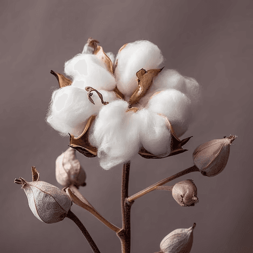
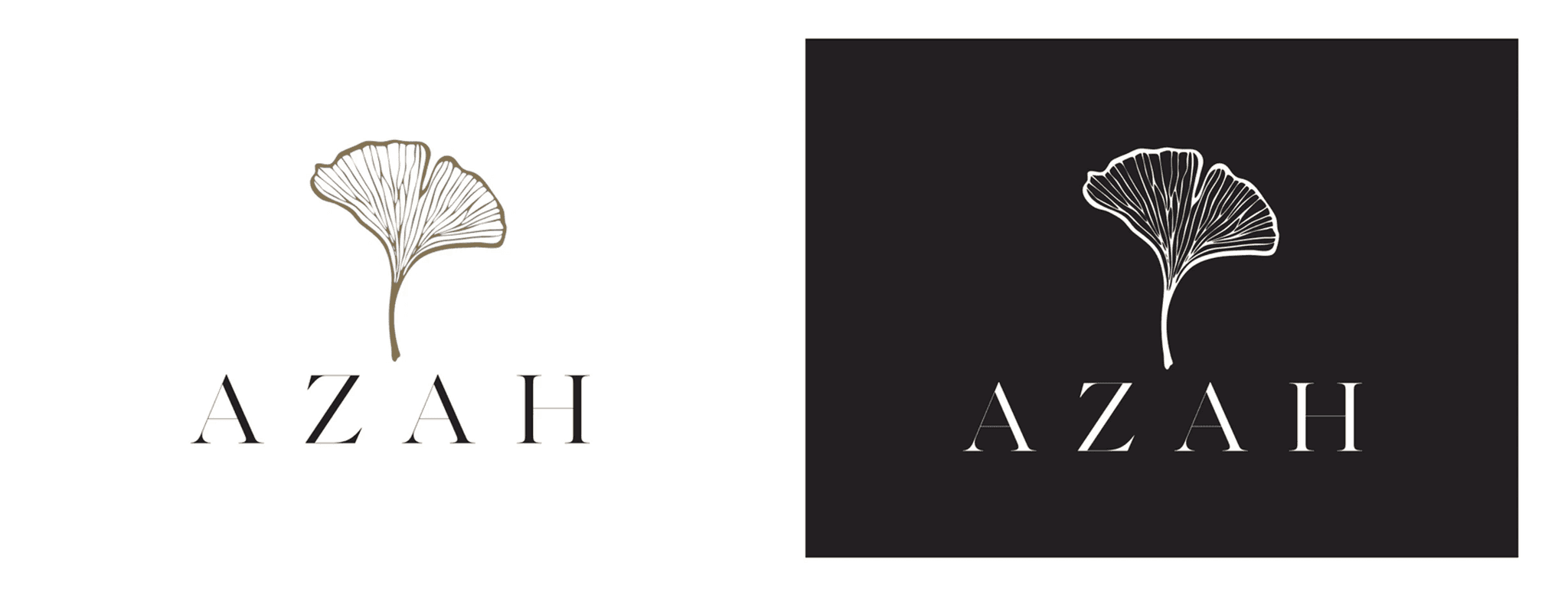
Taking inspiration from a cotton bud for its light-weight and organic nature. The logo caters to the needs of quality-conscious urban consumers. The logo fullfills Azah’s vision of one-stop solution for high-quality women's hygiene products in India.

Our brand font is Work Sans. It will be used in all kinds of brand communications and UI design.
Work Sans is a typeface family based loosely on early Grotesques, such as those by Stephenson Blake, Miller & Richard and Bauerschen Giesserei. The Regular weight and others in the middle of the family are optimised for on-screen text usage at medium-sizes (14px-48px) and can also be used in print design.

Keeping the target audience in mind (i.e., Quality conscious women of any age and ethnicity), we wanted our brand colors to evoke femininity, safety, and a welcoming feeling.
It's a colour often associated with resilience, dependency, security & safety. Our brand Azah focuses on solving some of the most critical problems in the feminine hygiene sector. So the colour represents our brand to the core.
Our most prominent service colour, primary colours can be used as the foundation for creating a theme for your product.
Lavender represents beauty and feminity. Lavender is considered to be the "grow-up" pink. It's lighter shades have a sacred place in nature, with lavender, lilac & violet flowers considered delicate and precious.
This colour palette will be utilized across various CTAs. Lavender will be employed to establish equilibrium, highlight product features, and differentiate between various sections within a visual design or UI.
It is warm, dynamic & invigorating. It blends the feminity of pink with the optimism & energy of orange.
Use sparingly to spread joy or celebrate positive moments. It will be used to create delight.
For texts, backgrounds & other subtle visual elements.
Examples of colour usage

Colour Hierarchy & Use
Colour indicates the level of hierarchy for each element and is used to distinguish and draw attention to important elements. The visual hierarchy of our colour system spans from primary, secondary and sparkle colours.
We will always use images with lighter backgrounds. We will avoid darker shades. Prefered choice of images will be in the shades of our brand colours.
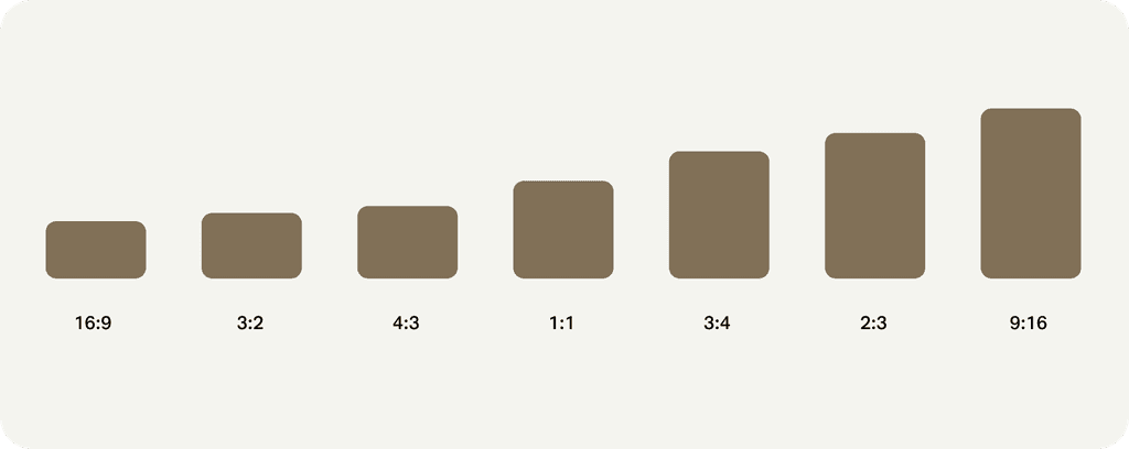
An aspect ratio is the proportional relationship between an image's width and height. To maintain consistency, we have formulated a set of aspect ratios that enable imagery, video and content to adapt to different viewport sizes and orientations.
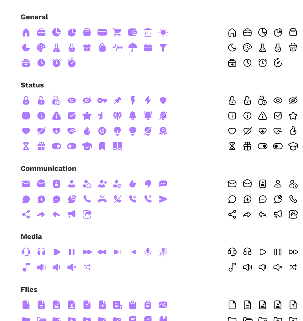
Our Iconography style is centred around a simple geometric system. Our brand logo also inspires the icon style. We have given a very subtle organic feel to every icon.
This aesthetic ensures no matter how our icons are being used they maintain consistency and clarity even at smaller sizes.
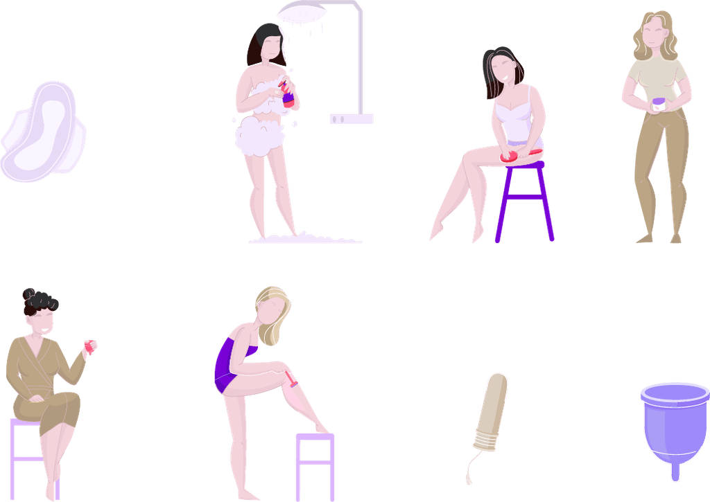
Here is an overview of the illustrations in the Azah Design Library. The primary purpose of an illustration is to help the viewer imagine a concept more vividly and guide them through their journey. Illustrations play a significant role in shaping our brand identity and enhancing the overall customer experience, bringing joy to our users.
Our style is characterized by fine hand-drawn lines and minimalistic design. This aesthetic is inspired by our logo, creating a friendly and welcoming atmosphere.
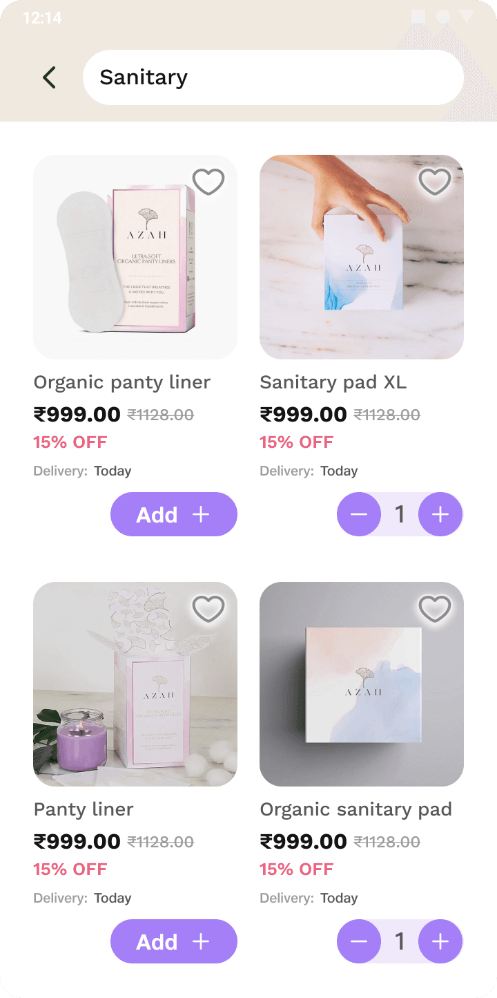
Azah has grown many folds since its inception. It now offers a diverse range of products related to women's health.
Check out their:
